
Hermosa Beach Pier

Black and white or color? Sometimes it's not an easy answer. Sometimes the answer is 'both'. My Into The Ocean project is in black and white. I made that choice because it allows for better comparison of the piers and usually it's what works best. During this trip to Hermosa Beach Pier, it wasn't such an easy choice.
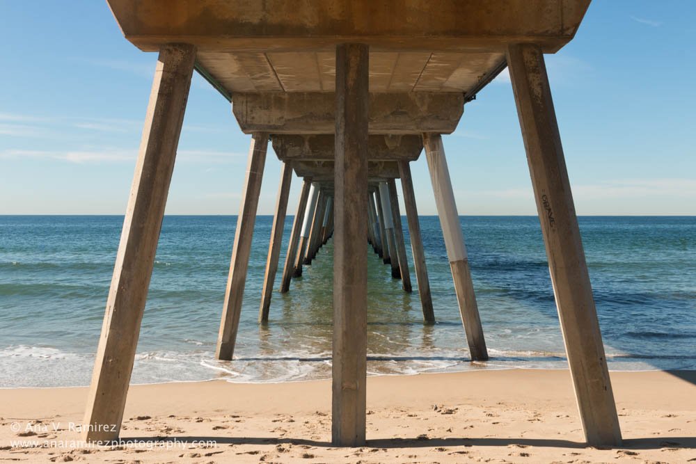
I met up that day with friend and talented photographer Kristina Jacob and we walked around, chatting and shooting. It was great to have company and to visit a pier that was new to both of us. Hermosa Beach Pier is a very modern pier - mostly concrete and steel on the top and built narrow and long. There's nothing at the end of it other than a beautiful view out into the ocean.
The pier is located in an area with lots of bars and restaurants and although it wasn't crowded when I first got there, the later it got the more crowded it got. There is parking, meters and parking lots, but watch the time limits because they do track how long you've been parked.
I usually like the light I get late morning for black and white images. The high contrast sunlight is great for highlighting shapes and forms along the pier. And it goes nicely with the fact that I am not good at getting up early.

The angle of the sun at the time turned the sand into a giant reflector, illuminating the pier from below. It was really an unexpected and appreciated surprise.
But the beautiful light also made the color of the ocean stand out and the choice between black and white or color became a little more difficult. Below you can see what I mean, both images have their appeal.

The choice between black and white or color is ultimately an artistic choice depending on what you want to convey. Which do you prefer and why?
By the way, for those not familiar with my Into The Ocean project you can read more about it here.